One major advantage of modern, self-service BI tools is that they let any user, not just data experts or technical staff, build out dashboards and visualizations. These tools are customizable and flexible, and they don't require much technical expertise to create powerful, effective visualizations.
This flexibility means that many businesses have begun to give their employees more freedom in building their own dashboards and visualizations. Instead of every visualization being made by a data team or by IT staff, many employees now have the tools to build visualizations themselves, without any input from anyone else.
In many ways, this is a net good for both the business and the employee. Employees can create dashboards that meet their needs more effectively, and businesses can ensure that their employees are understanding their data on a more personal level.
However, this approach can lead to some issues. Since the average employee rarely has any sort of formal training on dashboard design or data visualization, they're often unprepared to make effective use of their BI tool's visualization suite. Combined with a general disinterest from businesses to invest in training, this means that many employees are largely left to their own devices.
Self-service tools can only go so far. They can give employees the resources they need to create dashboards and visualizations, but ultimately, it's the employee's responsibility to make sure these visualizations are useful. At businesses that don't invest in visualization training, this is easier said than done.
There are many mistakes that dashboard builders and visualization designers can make, especially if they don't have any specific training in design principles. Novice BI users often don't even know that they're making these mistakes, which make them even harder to fix.
Here are some of the most common mistakes that novice BI users make, why they cause so many problems, how a user can identify them, and the best approaches for fixing them.
- Ignoring Data Transformation
At many businesses, the end user is responsible for the entire data process, from connecting their data all the way to visualization. It's very tempting to skip over some parts of this process, especially for those that have other responsibilities beyond data.
Data transformation is one of the parts that most often gets skipped, since it's often the most confusing part of the process, and its benefits aren't immediately noticeable. Users want to take their raw data from their connectors and funnel it directly into their visualizations, and they don't want to waste time transforming it.
In some cases, this is OK. Often, for pulling basic insight out of a data set that's already clean, it's fine to not worry about data transformation too much. However, for more complex data sets, transformation is essential.
If data isn't transformed correctly, then it can be harder to use in analysis and visualizations. Transforming data is also essential for combining different data sets. If a user plans to do something complex with their data, and they haven't transformed the data, it's going to be much harder.
Users that find that their data sets are too hard to use properly often need to transform the data set in some way to make it easier to use. When planning out a dashboard or visualization, it's important to think about what information will be necessary and the best way to transform the data to make that information easy to utilize.
- Failing To Answer Business Questions
Once a user has their data connected, and hopefully has gone to the trouble to transform the data, they have to decide what sort of analysis they want to perform.
This is where the trouble really begins. All too often, first-time data analysts just kind of click around until they end up with a visualization that looks impressive, instead of approaching the data analysis process with any sort of consistent framework.
Charitably, this approach could be called open-ended. Less optimistically, this approach leads to a lot of visually interesting charts and graphs that end up being mostly meaningless. Data designers need to have clear goals in mind before they start their analysis. This way, they can build content that's actually useful.
The best framework for approaching this process is thinking about which business questions the content is trying to answer. End users view dashboards to get answers to specific business questions; if the dashboard can't answer those questions, then end users won't use the dashboard.
Visualization designers have to figure out how to best use the data that they have to answer relevant questions. Instead of semi-randomly clicking around to discover new data trends, it's much more effective to go in with a concrete goal.
This approach is also better for learning how to visualize data. Users will eventually get the hang of what sort of analysis is most effective for answering which kinds of business questions.
This is the reason that so many beginner data analysts build dashboards that are visually interesting, but go unused. Beginners often focus on the form of their dashboard at the exclusion of function. While a dashboard should look good, it's more important that it actually answers the questions that its users need it to.
- Using the wrong visualization
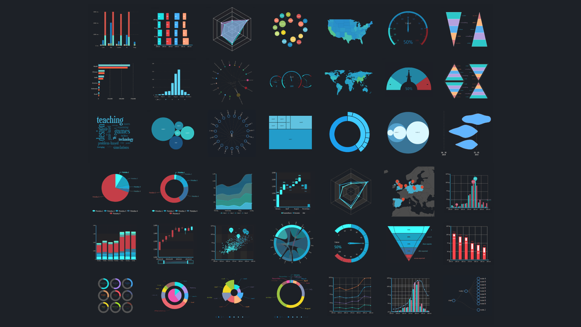
Not every answer is going to turn into an interesting visualization. It's more fun to use complex visualizations and crazy colors, but most of the time, business data is best conveyed through a simple line graph or bar chart.
When novice dashboard designers start to build out visualizations, they're often tempted to use more complicated methods. BI tools have dozens of different kinds of visualizations, and with that sort of selection, it can be hard to justify using just a basic bar chart.
However, complicated visualizations are generally harder to understand than simpler ones. Almost everyone can intuitively understand a basic line chart or map, but it's much harder to understand a treemap or heatmap.
In general, dashboard builders should be more worried about how easy the dashboard is to understand, than they are about how good the dashboard looks. Less complicated dashboards are generally easier to understand, so they're the best choice for most situations.
Of course, there are some situations that do call for more complex visualizations. Dashboard builders usually want to err on the side of simplicity, but they shouldn't completely ignore complex visualizations. Simplifying a complex analysis can end up distorting the implications of the data, which can be just as harmful to overall dashboard effectiveness.
Designers also need to know what sort of visualizations are the most effective for showing trends and relationships in a more general sense. They need to know which sorts of analysis calls for a line chart, what sort of data is best displayed on a bar chart, and so on. Often, designers can end up using the wrong kinds of visualizations for their data, which hurts how well it can be understood.
Fighting BI Mistakes
Many BI tools are moving to a more self-service model. They're more accessible to those without BI experience, and that's mostly a good thing. This way, more people can build their own dashboards and visualizations, without relying on data experts or having to wait for someone else to do it.
Self-service dashboards and visualizations are very valuable, since they allow users to tailor their own content. Users can better make content that they actually want to view, instead of relying on things made by people who didn't understand the end goals.
However, this approach comes with some risks. Users rarely come to their BI tool with any specific training in best practices for building BI content, and that means they often make mistakes. These mistakes mean their visualizations aren't as useful as they could be.
With more knowledge of what causes these sorts of mistakes, what they look like, and how to fix them, users can make dashboards and visualizations that are much more valuable.