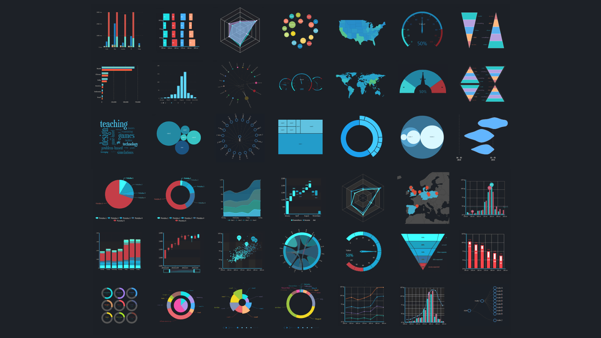
The dashboard is the most basic building block of any BI implementation. There are other important parts of a BI tool, like data connection and transformation, but dashboards are how data analysts actually turn their analysis into action. Because of this, they're the most important part of most businesses' BI strategy.
Often, a business that's invested in a powerful BI tool ends up garnering fewer benefits from it than they anticipate. The most common reason that businesses don't get the full benefit from their BI tool is that they don't focus on making intuitive, effective dashboards.
If someone were to focus on one aspect of BI that would make their data analysis more effective, focusing just on dashboard design would be a very good choice. Well-designed dashboards are supremely useful for any data-driven business, while a poorly designed dashboard can be actively unhelpful and lead viewers to draw the wrong conclusions about their data.
One reason so many businesses are suffering through poorly designed, ineffective dashboards is the rise of self-service BI. Self-service BI is a design paradigm that assumes that a layperson should be able to use a BI tool without much training or difficulty.
In general, the self-service BI approach is extremely valuable, and self-service BI tools are far more effective for most businesses that don't already have in-house data analysts. However, this approach can lead to some obstacles.
The biggest problem with self-service BI is that it expects people without much knowledge about dashboard design and best practices to build effective, useful dashboards. Without at least some training, this sets the average user up for failure.
One aspect of dashboard design that many beginner BI users aren't aware of is that there are different types of dashboard. Best practices for dashboard design shift and change as the goals and business questions of a dashboard change. There are three (or four, depending on who you listen to) main types of business dashboard.
Beginner dashboard builders should learn about these different types of dashboard so they can know when to use them and why. With a better understanding of the main types of business dashboard, they can build dashboards that are more useful for solving business problems and driving insight.
The Most Important Dashboard Types
Depending on who's talking, there are three or four main types of dashboards. The type of a dashboard affects the sort of design decisions that its builder should make, the sort of visualizations that will be the most effective in making its point, and even where the dashboard should be displayed to be maximally visible to its target audience.
The main elements that determine what type of dashboard would be best for answering a given business question are what sort of business question it is, what sort of answers need to be surfaced, and what sort of metrics need to be tracked.
Sometimes, a dashboard builder may look at their dashboard goals, business questions, and planned metrics, and figure out what type of dashboard they need to build. Other times, a dashboard builder may get asked to build a certain type of dashboard, and then go find the right metrics and business questions to populate it.
The three main types of dashboard are strategic dashboards, which provide a high-level overview of a certain goal, operational dashboards, which provide important real-time metrics about current business performance, and analytical dashboards, which provide a deeper view into one certain aspect of a business question.
The fourth type of dashboard, tactical dashboards, occasionally gets mentioned by some literature on dashboards, but generally, it's thought of as a subtype of strategic dashboards. Tactical dashboards focus a bit more on the operational aspects of a goal, and are generally used for temporary projects and campaigns.
Each of the different kinds of dashboards have different use cases. A strategic dashboard might not be very effective in a situation that calls for an analytical dashboard, and an operation dashboard wouldn't fit either.
Operational dashboards might be the most common type of dashboard. Operational dashboards are used to track overall performance of a certain aspect or aspects of business operations.
These sorts of dashboards are great for providing a real-time view into how things are performing, which can help employees to spot trends and react to changes. Since they're so useful in this way, it often helps to make operational dashboards available to everyone who might need or want the information that they contain.
Since they're designed for such a broad audience, operational dashboards aren't usually built with drill-down or ad-hoc analytical features in mind. Many of the people viewing the dashboard wouldn't have the ability to drill down anyway. Because of this, operational dashboards need to surface all the relevant information that its viewers need, so that there's no need to drill down.
Operational dashboards are often designed for a large audience without much data training and who don't necessarily have the ability to interact with the dashboard. It's usually best to use simple, intuitive visualizations that can be easily understood at a glance. Anything more complicated might confuse.
Dashboards of this type are often some of the most useful dashboards for embedded analytics. With embedded analytics, these kinds of dashboards can be embedded into apps and web pages that users access frequently, which helps to streamline workflows and make them more data-driven.
Strategic dashboards are the most important dashboard type for monitoring projects or strategic goals. Unlike operational dashboards, which just provide a view into current performance, strategic dashboards put this performance into context to show a business's progress towards its goals.
Often, these dashboards compare current performance to past performance to show how things are improving (or how they're not improving). This sort of comparison is known as benchmarking. More high-level strategic dashboards might compare metrics year-over-year or month-over-month, while more focused, timely dashboards might look at week-over-week or even day-to-day data.
Businesses can also use predictive analytics in strategic dashboards. In these sorts of dashboards, analysts might compare current metrics to predicted future trends. This sort of approach is also popular for setting quotas and forecasting future KPIs.
Managerial and executive dashboards are often strategic. These sorts of dashboards help decision makers use data to drive their choices, which make them very useful for data-driven organizations.
Strategic dashboards can also be more generalized and public-facing, as well. This is especially true of businesses that track the success of their employees against quotas; employees will naturally want to know their progress towards those quotas.
Generally, strategic dashboards need the sort of data visualizations that show clear trends over time and allow users to compare data points easily. Users should be able to understand these visualizations easily, but they can't be designed so simply that they lose all of their nuance. A balance is necessary.
Some amount of drill-down and ad-hoc analysis is good, since it can often be assumed that most of the people viewing the dashboard will have the permissions necessary to interact with it. However, there's no need to make these kinds of dashboards too interactive, since they'll still be public-facing a lot of the time.
Some businesses will want to use strategic dashboards for embedded content, while others will be OK with just limiting access to the dashboard to those who can access it through a BI tool.
Tactical dashboards are a subset of strategic dashboards, though some organizations treat them as a fully unique type of dashboard in their own right. Tactical dashboards are similar to strategic dashboards, in that they focus on monitoring progress towards goals using KPIs, but they're far more specific than strategic dashboards.
The goal for a strategic dashboard tends to be very broad. These dashboards cover a broad area, like 'Revenue' or 'Marketing Success'. Tactical dashboards, on the other hand, are much more narrow. They look at one specific, real-world goal, and track progress on that goal.
For example, a company might have a strategic dashboard that aggregates all their marketing data, so they can track the success of their marketing strategy overall. They then might also have individual dashboards for each marketing source, so that they can drill down and find problems with each one. These more focused dashboards would be tactical dashboards.
With these smaller, more focused dashboards, users can evaluate the success of each marketing channel independently of one another, which allows for a more precise knowledge of how the marketing is performing overall.
Often, these dashboards are paired with strategic dashboards, and are used as drill-down views or as sub-dashboards. It's not uncommon to see them as standalone dashboards, though, especially for teams that are focused on one specific part of an overall goal.
Tactical dashboards can also be useful for temporary projects, or for tracking metrics across one specific sprint or quarter. In this way, they can act more as operational dashboards, but for situations that have a clear start and end date.
Analytical dashboards are the last type of dashboard, and are generally the least common across an organization's BI strategy. That's not to say they're the least useful - they might have the most utility out of any dashboard type.
These types of dashboards are designed to allow for ad-hoc analysis of business data. They use interactive features and drill-down menus to help users to see new dimensions and trends in their data.
Analytical dashboards are great for situations where the relationships between data sources are unclear, or where there's still new insight to be discovered between different data sources. While they're generally too complex for the average employee, they're very useful for data analysts who want to find new insight, as well as decision makers who want to perform ad-hoc analysis.
These kinds of dashboards often use the same kinds of visualizations as other dashboards, but they include more filters, customization features, alternative views, and drill-down paths than other dashboard types. Dashboard designers really need to know their tool to put together a good analytical dashboard.
Predictive analytics are also a great use-case for this dashboard type. Analysts can perform 'what-if' scenarios, seeing how metrics might change as different variables are manipulated. They can also help with forecasting, showing decision makers how the changes they want to make will affect their future KPIs.
While these dashboards often require more data expertise to use properly, making these sorts of dashboards public can often encourage more data analysis from average employees. For this reason, they're especially popular for embedded work.
Dashboard types - an important element of dashboard design
The types of dashboard aren't hard and fast boundaries. Many dashboards will have elements of multiple different types of dashboards, and some dashboards might not fit into any type.
For example, it's common practice to insert some analytical features like filters and drill-down menus into strategic dashboards. An operational dashboard might have tactical sub-dashboards that dive deep into specific aspects of the operation.
Regardless of how the dashboard types blend, it's important to consider what sort of type a dashboard will be before adding visualizations or connecting data sources. A user won't get the same sort of value that they get out of a strategic dashboard from an operational one.
Each of the dashboard types have their own strengths and weaknesses, and a situation that calls for one dashboard type will be badly served by a different type. It's the responsibility of a good dashboard designer to properly tailor each dashboard to each situation and make sure it's as useful as it can possibly be.
If you feel that your BI tool doesn't have the dashboard functionality that you need to survive, contact us today. Our team of experts can help you find the software that will work best for your use case. Get free BI advice in a no-cost, no-obligation consultation.