
Thanks to cloud-based BI, data analytics isn't tied to a specific location or piece of hardware. As long as they know their credentials, users can log into their BI instance from any Internet-connected device, anywhere.
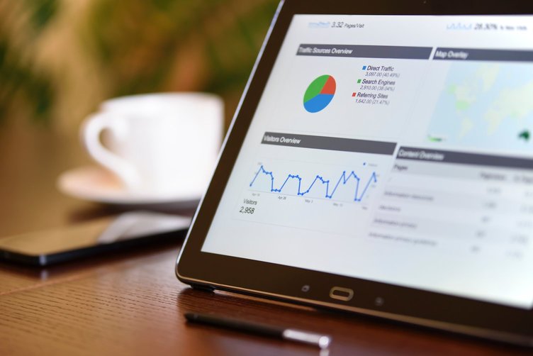
Many people access their BI tool remotely from a laptop or other PC, but laptops aren't the most convenient for people who just want to glance at their visualizations during their commute or on their lunch break. It's much easier just to use a smartphone to view visualizations and interact with data.
However, web apps on smartphones are all kind of universally terrible. No BI tool can provide the same level of service on a 5-inch phone screen as it can at a regular desktop workstation. Smartphone users need some other way to use their BI tool on the go.
To solve this problem, most cloud-based BI tools have native, mobile-first smartphone apps for viewing and interacting with data from a mobile device. Mobile apps are an important part of the BI space now, and vendors are taking mobile BI very seriously.
As users do more with their smartphones and tablets, and less with laptops and desktops, mobile BI will get more and more important. Some BI vendors are already designing parts of their product with a mobile-first design, anticipating that a larger percentage of their users will want to interact with their mobile app than the desktop app.
Many businesses are finding that more and more of their BI users are interacting and viewing their BI tool using the mobile app, rather than using the web app. For businesses like these, it's important to prioritize mobile-first dashboard design.
Embedded analytics also means businesses need to think about how all of their visualizations will show up on a smartphone, not just internal ones viewed through a BI app. Many businesses use embedded solutions to place visualizations on public webpages. When site visitors access the site through a mobile browser, they should be able to make sense of the visualization.
As more people interact with BI using smartphone apps and mobile browsers, businesses need to make sure that their dashboards and visualizations are just as useful to mobile users as they are to desktop users. They need to consider what their visualizations will look like for mobile users before they make their visualizations public.
Mobile-first visualizations
Businesses that think a large percentage of their users will be interacting with their visualizations from a mobile device should build their visualizations to be mobile-first. At the very least, they should build them to be mobile-friendly.
Mobile-friendly isn't necessarily the same thing as mobile-first. A mobile-friendly visualization can be viewed without difficulty on a mobile device, but isn't specifically designed for mobile users. Mobile-first visualizations, however, are specifically designed for consumption on a mobile device.
A mobile-friendly visualization isn't necessarily mobile-first, but a mobile-first visualization can be assumed to be mobile-friendly. In general, businesses should design most of their dashboards and visualizations to be mobile-friendly if they think people will be accessing their dashboards with a smartphone, but use mobile-first visualizations when they think a substantial percentage of their users will be on mobile.
Tips for mobile-first visualizations
When talking about mobile-first visualizations, it helps to first understand how a smartphone's display and UX differs from a basic desktop. This way, dashboard builders can be more aware of what needs to change and why.
The main things to consider on a smartphone are the size of the screen, the shape of the screen, and how the user interacts with UI elements on a page.
A smartphone's screen is much smaller than the average laptop screen or desktop monitor, and that changes how users can see and interact with the visuals on it. Visualizations that take up a lot of screen real estate will need to be minimized so that they can fit on a mobile screen. Dashboards won't be able to include as many visualizations; the average phone screen might only be able to show three or four.
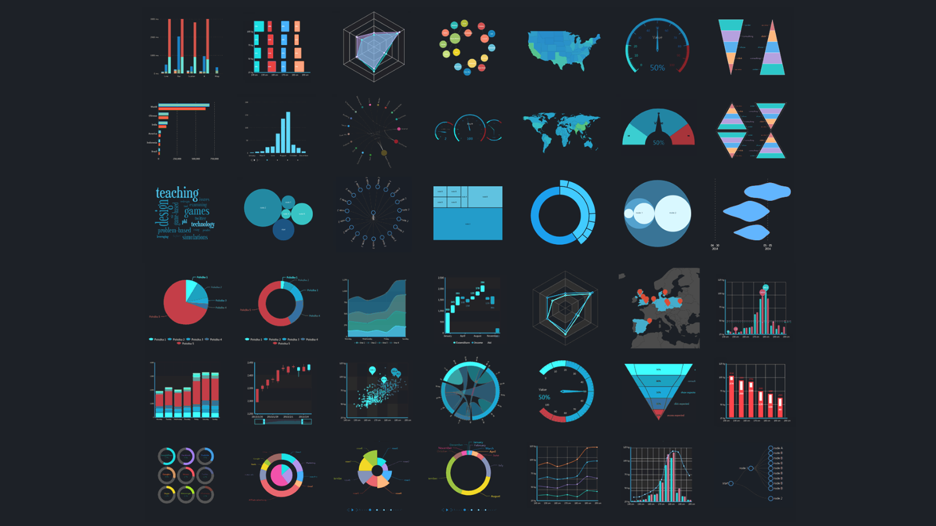
This space limitation also affects what sort of visualizations dashboard builders should use. Many common types of visualization are hard to read on a small mobile screen, so they should be avoided. Basically, the more information a visualization is trying to communicate at once, the harder it will be to understand on mobile.
This makes things like grouped and nested bar charts, line charts with multiple lines, and maps with lots of regional data all bad choices for mobile-first visualizations.
Dashboard designers also need to be conscious of the shape and orientation of a phone screen. Pretty much everyone uses laptops and desktop monitors horizontally, and that's the default way basically every web app displays information.
Most people usually use their phones vertically; this means that basically everything on a webpage is going to get shifted around and put in different arrangements. A dashboard builder might carefully arrange a dashboard to be viewed on a horizontal desktop, just to have all that work be undone by a user looking at it on a phone.
Often, building mobile-first dashboards is as simple as arranging a dashboard in narrow vertical rows instead of horizontally, so that it'll fit easier on a phone screen. Designers might also want to use visualizations that read better vertically, so that it's easier for a user to read them at a glance.
Mobile users can switch their phone orientation to landscape rather than portrait, but even then, their viewport is narrower and squatter than a laptop or desktop. They probably won't be able to see more than two rows of visualizations at once.
Lastly, it's important to think about how users interact with their phone. Instead of using a mouse and keyboard, like with a desktop, mobile users navigate their devices using its touchscreen.
In some ways, a touch screen is easier and more intuitive to use than a mouse and keyboard, but it can often be a bad fit for navigating a complex BI dashboard. A touchscreen doesn't have the same kind of granularity that a mouse and keyboard has, which can easily lead to users clicking on things they don't want to click on.
Dashboard designers need to plan around that limitation when constructing drill paths and adding clickables to their visualizations. A country map with lots of clickable areas might be useful on desktop, but it'll probably be an annoyance on mobile.
Things to consider
Just like many other BI tools, mobile-first visualizations are a tool that's most useful in some specific situations, and aren't as useful in other situations. Some businesses won't care about making their visualizations mobile-first, since they don't have a large population of users who access visualizations through the mobile app.
It also depends on the visualization. There are many kinds of dashboards where making them mobile-first won't make much of a difference, since no one will view them remotely anyway. These dashboards usually have non-critical information, have information that's only actionable in-office, or don't update frequently enough for it to make a difference.
Businesses that aren't embedding their dashboards and visualizations don't have to worry about their mobile presence as much as businesses that do. Since they aren't embedding their content, they know that users are only going to access their BI instance in a few different ways.
Many dashboard designers assume that if they're building their visualizations to be mobile-first, then their visualizations will be less effective on desktop. However, that isn't necessarily true. While designing visualizations mobile-first does mean that the desktop experience is less prioritized, that doesn't have to mean the visualization is less useful on desktop.
In general, designing for desktop is far less limiting than designing for mobile, and it's pretty easy to be mindful of desktop's limitations while building mobile visualizations. Mobile's limitations are a lot harder to work around when building a desktop visualization, though.
A desktop user might not even notice that a dashboard or visualization is mobile-first, since a mobile device's limitations don't really exist on desktop. However, a mobile user will almost definitely notice when a visualization was designed for desktop, since they won't be able to use it effectively.
Conclusion
Mobile BI is becoming more and more common, as people do more remote work and as businesses use embedded analytics to put their content on public web pages. For many businesses, it's making more sense to design dashboards primarily for mobile consumption, since so many of their users, clients, and customers use mobile devices to access their BI content.
When designers build dashboards and visualizations for mobile consumption, they need to be conscious of the differences between the mobile and desktop BI experience. Some key considerations are the size and shape of the mobile viewport, and how using a touchscreen changes how people interact with content.
Not every business needs to design mobile-first visualizations. For many companies, it's enough to make their visualizations mobile-friendly. Of course, not every visualization needs to be mobile-friendly. Many visualizations don't need to be mobile-friendly, or even can be made mobile-friendly.
Mobile-first dashboards are very important for businesses that do a lot of remote work, share their content publicly, or want their employees to react in real time to changes. For more information on mobile BI, check out our list of the best mobile BI platforms, or contact us today.


